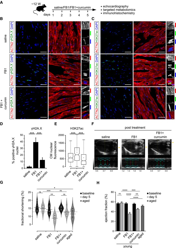
Schematic representation of the experimental set‐up employed in the in vivo mouse experiments (n = 6 animals per condition). 12‐week‐old C57BL/6J mice were injected i.p. once daily with PBS, FB1 (6.75 mg/kg) or FB1 and curcumin (6.75 and 50 mg/kg, respectively) for five consecutive days (n = 6 animals per condition).
Representative micrographs depicting γH2A.X staining on the ventricle sections for the indicated cohorts. Insets on the right depict magnified view of cardiomyocyte nuclei (n = 6 animals per condition). ACTN2 is used to label mouse cardiomyocytes.
Representative micrographs depicting H3K27ac staining on the ventricle sections for the indicated cohorts (n = 6 animals per condition). ACTN2 is used to label mouse cardiomyocytes.
Quantification of γH2A.X+ CMs nuclei represented as percentage bar graph. Data are represented as bar graph depicting percentage mean of the γH2A.X+ CMs population. For quantification, five randomized micrographs, representing independent regions of the ventricles from six different animals per condition, were used (n = 6 animals per condition).
Box‐plot depicting the distributions of the corrected total nuclear fluorescence of the indicated cohorts. Data depict corrected total nuclear fluorescence estimated from greyscaled immunostained micrographs of the ventricular region from the mice treated with the indicated compounds. Extremes of the error bars represent non‐outlier range, and their length represents the variability within the data. Horizontal line with the bar represents median of the underlying population (n = 6 animals per condition). Box plot whiskers show 1.5 IQR of highest and lowest quartile. Extremes of the error bars represent non‐outlier range and their length represents the variability within the data. Horizontal line and dot within the bars represent median and mean of the underlying population, respectively. Notch represents confidence interval around the median.
Representative images depicting ventricular view from the echocardiography of the indicated cohorts. Cyan lines indicate the margins of epicardium and endocardium, the green dashed lines indicate the minimum diameter and the red lines measures the maximum diameter during a heart cycle. The smaller the relative difference between red and green line, the worse is systolic heart function.
Bean‐plot depicting the quantification of fractional shortening in the indicated groups (n = 6 animals per condition). Horizontal lines depict the mean of the underlying distributions.
Bar graph depicting the quantification of ejection fraction (in percentage) in the indicated groups (n = 6 animals per condition).
Data information: Error bars in panels (D and H) represent standard error of the mean. For pairwise comparisons, Student's
t‐test was performed for the estimation of the statistical significance. For the comparison of fluorescence signal intensities (panel E), KS‐test was used as a measure of statistical significance. For panels (G and H), ANOVA was used for the estimation of the statistical significance.
P‐value cut‐off used for computing statistical significance is < 0.05. *, **, *** and **** in the figure refer to
P‐values ≤ 0.05, ≤ 0.01, ≤ 0.001 and ≤ 0.0001, respectively. Statistically non‐significant comparisons are annotated as ns. Scale bars for (B and C) = 50 μm and for insets 2 μm.

