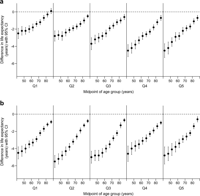
Fig. 2.
Difference in life expectancy in men (a) and women (b) in Scotland, period 2012–2014; data are calculated as the value for type 2 diabetes cohort minus value for type 2 diabetes-free population; negative values indicate lower life expectancy in the type 2 diabetes cohort. Data are stratified by SIDM quintile (Q1 = most deprived). The horizontal axis shows the midpoint of age interval (e.g. age interval 40–45 is plotted at 42). The vertical axis shows the difference in life expectancy (years); the dashed horizontal line marks zero (‘no difference’). Error bars represent 95% CI

