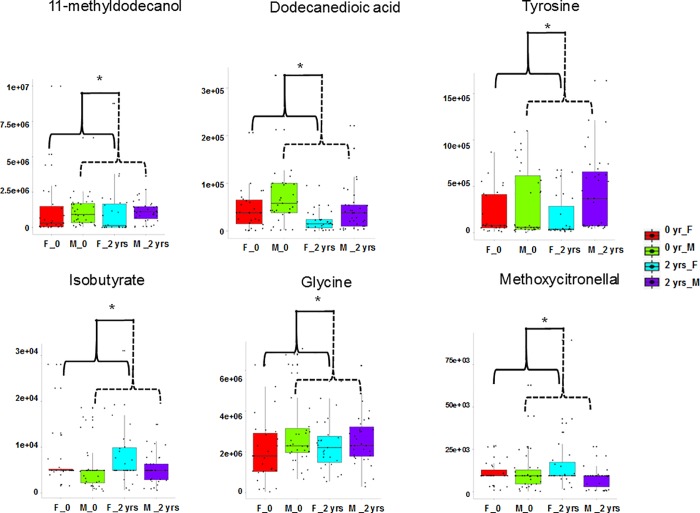
Fig 3. Relative abundances of metabolites that are significantly (ANOVA, P < 0.05) sex-dimorphic.
In the box-plots, the center lines show the medians; box limits indicate the 25th and 75th percentiles; whiskers extend 1.5 times the interquartile range from the 25th and 75th percentiles, outliers are represented by dots; crosses represent sample means; data points are plotted as black dots. Widths of boxes are proportional to square-roots of the number of observations.

