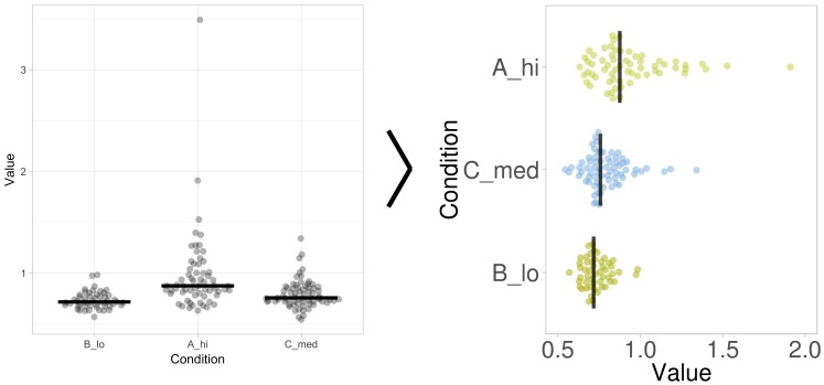
Fig 4. The layout of the graph generated by PlotsOfData can be further refined.
The standard output of PlotsOfData (left panel) can be tuned to enhance the presentation. The graph on the right is generated by changing the visibility of the statistics, sorting of the conditions according to median value, rotating the plot, removing the grid, adjusting the scale, adding colors for the data, and adding a figure description.

