. 2019 Apr 8;8:e40260. doi: 10.7554/eLife.40260

Figure 2. Variation in C. elegans wild isolates responses to arsenic trioxide maps to the center of chromosome II.

(A) A manhattan plot for the first principal component in the presence of 1000 µM arsenic trioxide is shown. Each dot represents an SNV that is present in at least 5% of the assayed wild population. The genomic position in Mb, separated by chromosome, is plotted on the x-axis and the -log10(p) for each SNV is plotted on the y-axis. SNVs are colored red if they pass the genome-wide Bonferroni-corrected significance (BF) threshold, which is denoted by the gray horizontal line. SNVs are colored pink if they pass the genome-wide eigen-decomposition significance (ED) threshold, which is denoted by the dotted gray horizontal line. The genomic region of interests surrounding the QTL that pass the BF and ED thresholds are represented by cyan and pink rectangles, respectively. (B) Tukey box plots of phenotypes used for association mapping in (A) are shown. Each dot corresponds to the phenotype of an individual strain, which is plotted on the y-axis. Strains are grouped by their genotype at the peak QTL position (red SNV from panel A, ChrII:7,931,252), where REF corresponds to the allele from the reference N2 strain. The N2 (orange) and CB4856 (blue) strains are highlighted. (C) Fine mapping of the chromosome II region of interest (cyan region from panel A, 7.60–8.21 Mb) is shown. Each dot represents an SNV present in the CB4856 strain. The association between the SNV and first principal component is shown on the y-axis and the genomic position of the SNV is shown on the x-axis. Dots are colored by their SnpEff predicted effect.

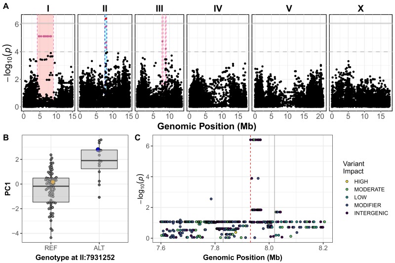
Figure 2—source data 1. Fine-mapping results for PC1.
DOI: 10.7554/eLife.40260.040
Figure 2—source data 2. All wild-isolate traits used for genome-wide association mapping.
DOI: 10.7554/eLife.40260.041
Figure 2—source data 3. Genotype matrix used for genome-wide mapping.
DOI: 10.7554/eLife.40260.044
Figure 2—source data 4. GWA mapping results for PC1.
(Used to generate Figure 2A–B).
DOI: 10.7554/eLife.40260.045

Figure 2.

Figure 2—figure supplement 1. GWA mapping QTL summary.

Figure 2—figure supplement 1.

All QTL identified by GWA mapping above the eigen significance threshold are shown. Traits are labeled on the y-axis and the genomic position in Mb is plotted on the x-axis. Only PCs that explain greater than 90% of the variance are shown. Triangles represent the peak QTL position, and bars represent the associated QTL region of interest. Triangles and bars are colored based on the significance value where red colors correspond to higher significance values.
Figure 2—figure supplement 1—source data 1. All QTL identified by GWA mapping (Used to generate Figure 2—figure supplement 1).
DOI: 10.7554/eLife.40260.032
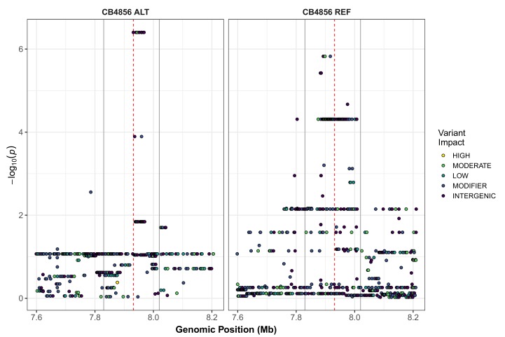
Figure 2—figure supplement 2. Fine-mapping of the chromosome II QTL identified by GWA mapping.

Figure 2—figure supplement 2.

Fine mapping of the chromosome II region of interest (cyan region from Figure 1A, 7.71–8.18 Mb) is shown. Each dot represents an SNV present in the phenotyped population. SNVs present in the CB4856 strain are shown in the left panel and SNVs present in other phenotyped strains, but REF in CB4856, are shown in the right panel. The association between the SNV and first principal component (PC1) is shown on the y-axis, and the genomic position of the SNV is shown on the x-axis. Dots are colored by their SnpEff predicted effect.
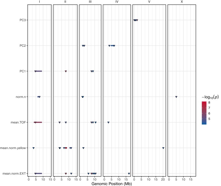
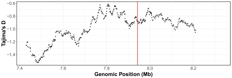
Figure 2—figure supplement 3. Tajima’s D across the arsenic trioxide QTL confidence interval.

Figure 2—figure supplement 3.

Divergence, as measured by Tajima's D, is shown across the arsenic trioxide QTL confidence interval (II:7,430,000–8,330,000). The whole-genome SNV data set (Cook et al., 2016; Cook et al., 2017) was used for Tajima’s D calculations. Window size for the calculations was 500 SNVs with a 10 SNV sliding window size. The vertical red line marks the position of the dbt-1 locus.
Figure 2—figure supplement 3—source data 1. Isolation locations of strains used in GWA mapping.
(Used to generate Figure 2—figure supplement 3).
DOI: 10.7554/eLife.40260.035
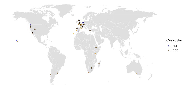
Figure 2—figure supplement 4. The worldwide distribution of the DBT-1(C78S) allele.

Figure 2—figure supplement 4.

Cysteine (REF) is shown in orange, and serine (ALT) is shown in blue. Latitude and longitude coordinates of sampling locations were used to plot individual strains on the map.
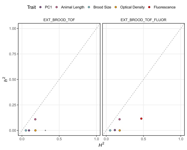
Figure 2—figure supplement 5. Genomic-heritability estimates of GWA mapping traits.

Figure 2—figure supplement 5.

The genomic broad (H2)- and narrow (h2)-sense heritability estimates calculated using the realized relatedness matrix are shown. Each dot represents a measured or principal component trait. The five traits discussed throughout the manuscript are highlighted (purple: first principal component, pink: mean animal length, blue: brood size, orange; mean normalized optical density, and red: mean normalized yellow fluorescence). The four input traits for PCA in the left panel are mean normalized optical density, brood size, and mean animal length. For the right panel, mean normalized yellow fluorescence was also added.
Figure 2—figure supplement 5—source data 1. Genomic heritability estimates of wild isolate traits.
(Used to generate Figure 2—figure supplement 5).
DOI: 10.7554/eLife.40260.038
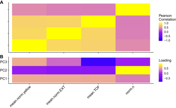
Figure 2—figure supplement 6. Trait correlations and principal component loadings of GWA mapping experiment.

Figure 2—figure supplement 6.

(A) The Pearson’s correlation coefficients of the assay- and control-regressed for measured traits are shown. (B) The contribution of each measured traits to the principal components that explain 90% of the total variance in the GWA mapping experiment, which was performed at 1000 µM, is shown. For each plot, the tile color represents the value, where yellow colors represent higher values.
Figure 2—figure supplement 6—source data 1. Wild isolate trait loadings of principal components (PCs) for the PCs that explain up to 90% of the total variance in the trait data.
DOI: 10.7554/eLife.40260.042
Figure 2—figure supplement 6—source data 2. Wild isolate trait correlations.
DOI: 10.7554/eLife.40260.043