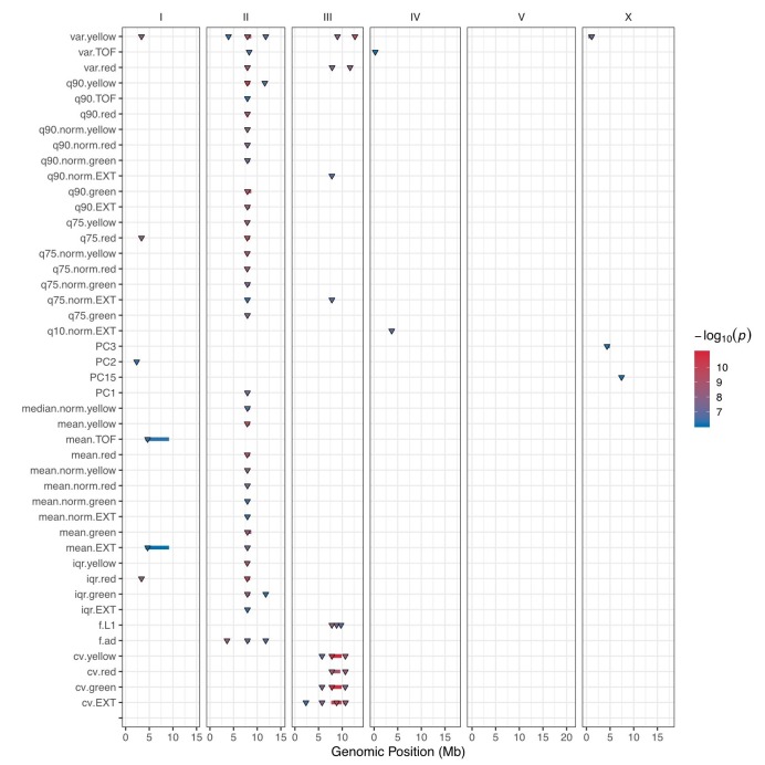
Author response image 1. GWA mapping QTL summary.
All QTL identified by GWA mapping are shown. Traits are labeled on the y-axis, and the genomic position in Mb is plotted on the x-axis. Triangles represent the peak QTL position, and bars represent the associated QTL region of interest. Triangles and bars are colored based on the significance value, where red colors correspond to higher significance values.

