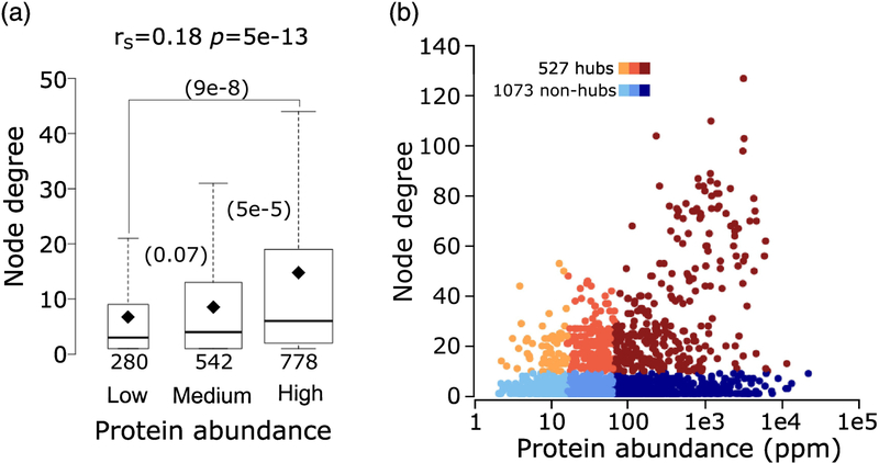
Figure 5.
Relating protein abundance to the number of interaction partners (node degree) in the yeast interactome.
a) Boxplots of the number of interaction partners (node degree) for proteins in three ranges of abundance: low (2 – 15.5ppm), medium (15.6 – 64.7ppm) and high (64.8 – 21866ppm). P-values (computed using the Wilcoxon rank-sum test) between pairs of distributions in the three abundance ranges are given in parentheses. The number of data points in each distribution (n) is shown below each boxplot. The horizontal line in each boxplot indicates the median value and the diamond indicates the mean value. Outliers are not depicted in the panel. b) Scatter plot of protein abundance versus node degree. Hub proteins (those with ≥10 interaction partners) are colored from orange to brown and non-hubs (<10 interaction partners) are colored from light to dark blue, according to the 3 protein abundance ranges given in (a). Hubs represent 22%, 30% and 39% respectively, of proteins of low-, medium- and high abundance in the HC Collins interactome.

