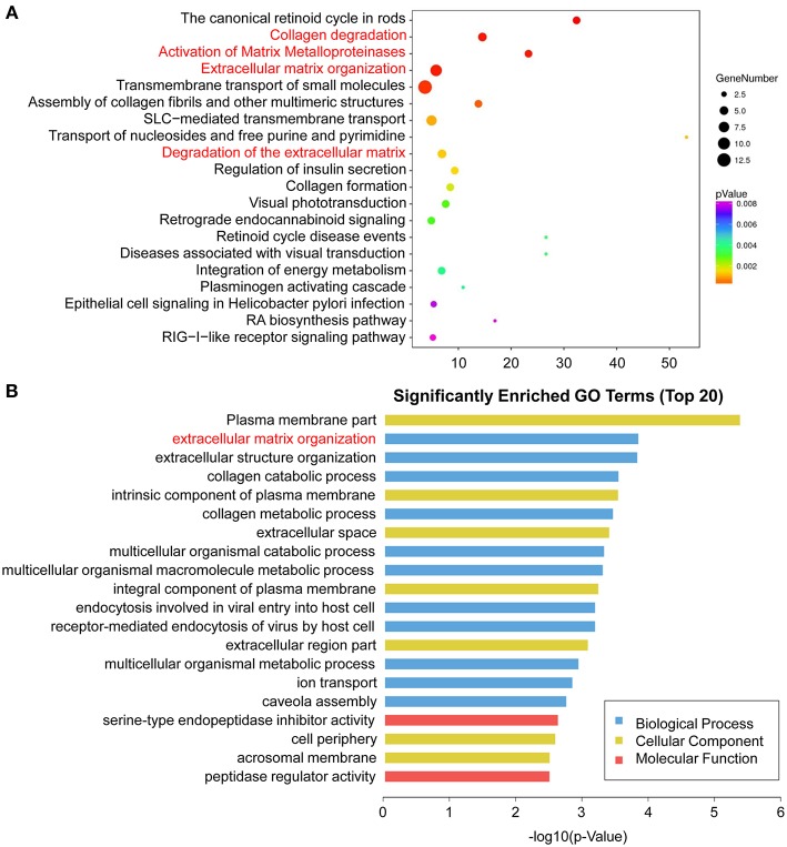
Figure 6.
Enriched pathway statistics and GO functional classification of the DEGs. (A) Scatter plot of enriched pathway statistics. These differentially expressed genes were grouped into gene pathways using the pathway enrichment analysis with the databases of KEGG, BioCyc, Reactome, and Panther. The color and size of the dots represent the range of the p-value and the number of DEGs mapped to the indicated pathways, respectively. Top 20 enriched pathways are shown. (B) Top 20 significantly enriched GO terms. The DEGs are summarized in three main categories: biological process (blue), molecular function (red), and cellular component (yellow). The x-axis indicates -log10 (p-value) and the y-axis indicates different GO terms.

