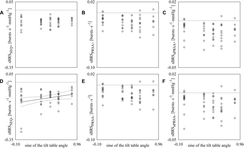
FIGURE 4.
The scatter plots show the results of the linear correlation analysis between sBRS estimates and the sine of the tilt table angles. Each circle represents the sBRS estimate computed in a subject in the assigned experimental condition. sBRS was estimated via SEQ (A,D), PRSA (B,E), and nPRSA (C,F) methods. The sBRS estimates were obtained by separately considering positive (A–C) and negative (D–F) DAP variations. The linear regression line (solid line) and its 95% confidence interval (dotted lines) are plotted only if the Pearson correlation coefficient is significantly different from 0 with p < 0.05.

