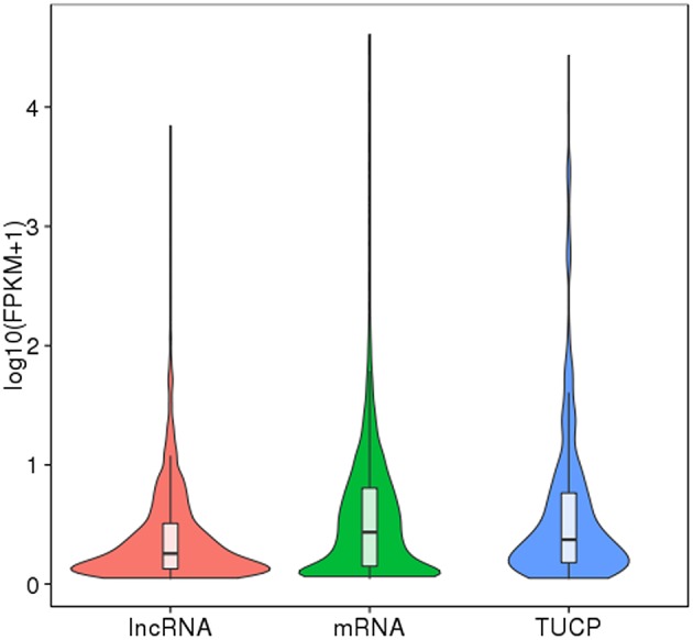
Figure 4.

FPKM distribution of transcripts. The boxplot inside shows the FPKM distribution. The five characteristic values indicate maximum, upper quartile, mid-value, lower quartile, and minimum, respectively. The violin diagram shows the FPKM density distribution. The width of violin diagram represents the density of transcript under a certain expression level.
