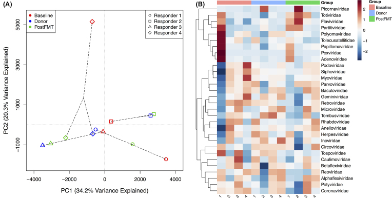
Figure 4.
(A) PCoA of known virus abundances based on metagenomic sequence data from the four responders. The PCoA is based on Manhattan distances between the samples. The circles, squares, triangles, and diamonds represent Responder 1, Responder 2, Responder 3, and Responder 4, respectively. Red, blue, and green represent Baseline, Donor, and PostFMT samples, respectively. (B) Heatmap showing the relative abundances of 30 known virus families in samples from the four responders and their FMT donors. The numbers under each column in the heatmap indicate the corresponding subject for that column (Responders 1–4).

