
Fig. 5.
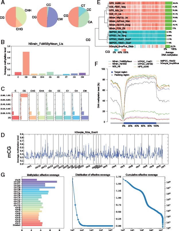
Graphs generated by CGmapTools. (A) Pie chart plots for DNA methylation contributions by different contexts in the sample hBrain_FcM55yNeun_Lis. (B) Bar plots for bulk DNA methylations in different contexts. (C) Distribution plot for DNA methylations in different contexts. (D) Distribution plots for mCG are shown in bins across the whole genome for single sample hOocyte_Rrbs_GuoH. (E) Heatmap plot for DNA methylation in bins across multiple samples. Average methylation levels of CpG are shown on the right, and a hierarchical clustering tree is built based on Spearman’s correlation coefficients. (F) Distribution plot of CpG methylation levels in fragmented regions across gene bodies. (G) The chromosome-wide MEC (left), density plot of MEC, and cumulative distribution of MEC (right) in AML sample