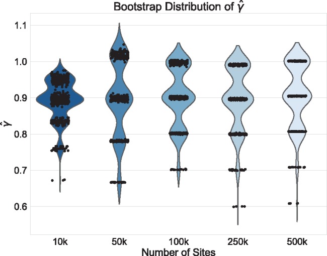
Fig. 2.

Violin plots of the distribution of  across 500 bootstrap replicates for 10,000, 50,000, 100,000, 250,000, and 500,000 sites for the non-uniform hybridization simulations. The black dots in each violin plot represent the actual values of
  that were estimated by each replicate (black dots are jittered). The pattern of jumping between distinct values of
  with no estimates in between are a strong indication of non-uniform admixture.
