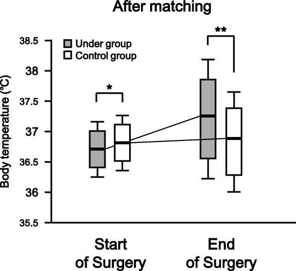
Fig. 3.

The body temperatures in both groups at the start and end of surgery after propensity score matching. The box and whisker plot shows the median (bold line in box), 25th–75th percentile (top and bottom of the box), and 1.5-fold interquartile range (ends of whiskers) values. *: P < 0.05 vs. Control group. **: P < 0.01 vs. Control group
