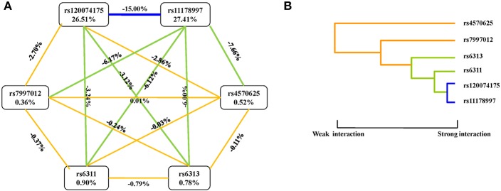
Figure 1.
Interaction graphs and dendrograms. (A) Interaction graphs. The percentage at the bottom of each SNP represents its interaction entropy, and the percentage on the line represents the percentage of interaction entropy between two SNPs. The golden line indicates additivity, while the blue or green lines indicate redundancy interaction. (B) Interaction dendrograms. The golden line represents additivity, while the blue line represents redundancy interaction. The shorter the dendrograms arm, the stronger the interaction.

