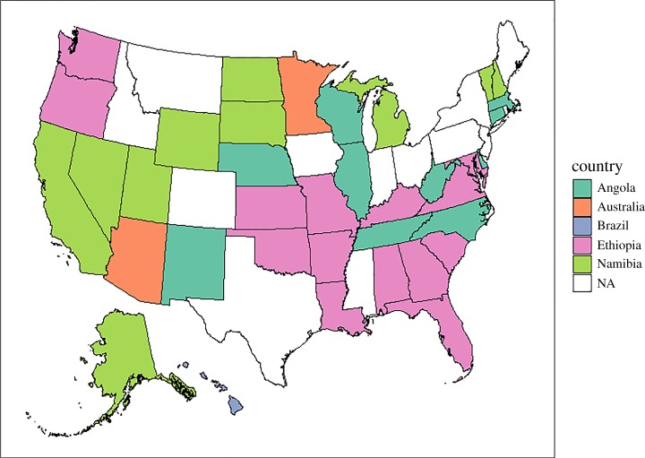
Figure 2.
Map of the USA (not to scale). Each state represents one study home (n = 37). State fill colour represents the country (Angola, aquamarine; Australia, salmon; Brazil, light purple; Ethiopia, magenta; Namibia, green) that was identified as most frequent from a subset of the 100 global grid cells with most similar climate to each study home. States not included in the analysis are shown in white. Map was generated with R (version 3.3.2; http://www.R-project.org) packages ggplot2 (http://CRAN.R-project.org/package=ggplot2), mapproj (version 1.2-4; https://cran.r-project.org/package=mapproj), rgdal (version 1.2-7; https://cran.r-project.org/package=rgdal) and sp (version 1.2-4; https://cran.r-project.org/package=sp). State boundaries (5 m resolution) were obtained from the US Census Bureau (https://www.census.gov/geo/maps-data/data/cbf/cbf_state.html).

