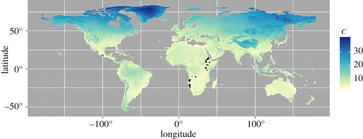
Figure 3.
Map depicting the climate dissimilarity index (C) between the mean indoor climate of the North American homes (n = 37; 2013–2014) and the outdoor climate of terrestrial 0.5° global grid cells (n = 67 420; 2012). Dissimilarity increases as C increases (yellow to blue). Cells depicted in black are those grid cells with the climatic conditions most similar to the average North American home in terms of temperature and humidity (n = 100). Map was generated with R (version 3.3.2; http://www.R-project.org) packages ggplot2 (version 2.2.0; http://CRAN.R-project.org/package=ggplot2), rgdal (version 1.2-7; https://cran.r-project.org/package=rgdal), sp (version 1.2-4; https://cran.r-project.org/package=sp), and rworldmap (version 1.3-4; https://cran.r-project.org/package=rworldmap), which uses Natural Earth data (version 1.4.0; http://www.naturalearthdata.com) for country borders.

