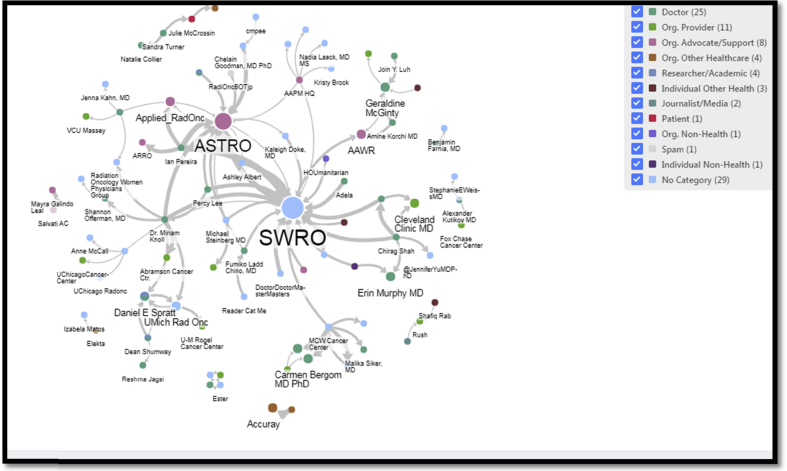
Fig. 4.
Network analysis of the #WomenWhoCurie hashtag campaign. This network analysis graph depicts conversation and mention patterns between the most central Twitter users of the #WomenWhoCurie campaign in November 2018. The circles represent each Twitter user who participated. The larger the circle, the more influential the user in the campaign. The lines connecting these circles represent the communications between the individuals, with the thickness of the line representing the frequency of communication.

