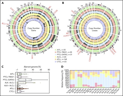
Figure 5.
Comparison of CNAs found in PTCL entities/subgroups. Circos plots comparing the frequency of gains (A) and losses (B) found in PTCL entities/subgroups (AITL, PTCL-TBX21, PTCL-GATA3, ALCL, ATLL, and CTCL). The dark gray shading denotes aberrant regions. The scale lines represent 20% increments. (C) Boxplot of the aberrant genome in PTCL entities/subgroups. The dot plot overlay represents the aberrant genome of individual samples separated into 1% bins. (D) Relative frequency distribution of CNAs presenting at a frequency ≥25% in ≥1 PTCL entity or subgroup.

