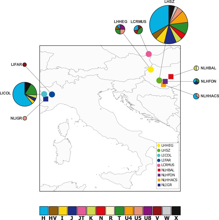
Fig. 1.
Geographical and genetic relationship between LC and NLC populations. Here and through the other figures LC cemeteries are represented by a circle while NLC ones are indicated by a square. Pie charts representing the frequencies of the major haplogroups in the populations. The size of the charts is proportional to the number of samples inside each necropolis

