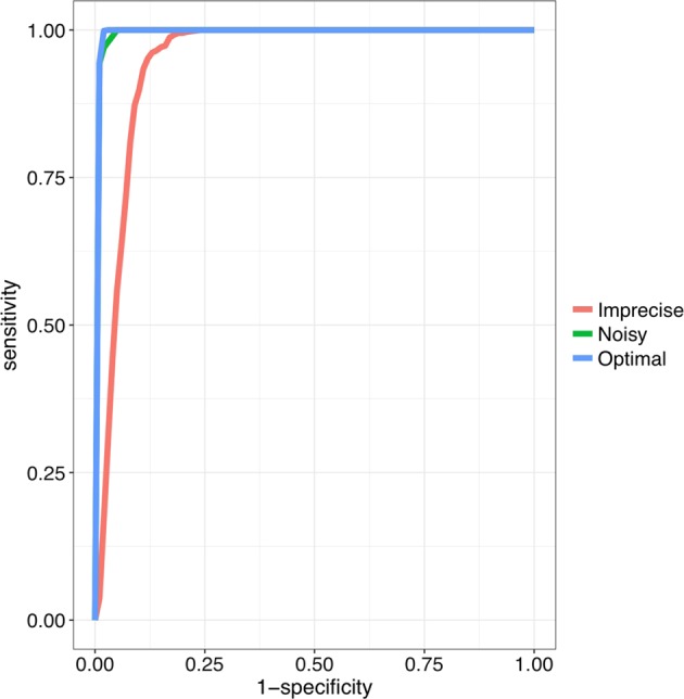
Fig. 3.

Benchmarking Phenoxome on simulated patient profiles. Blue curve is the ROC of Phenoxome’s performance on the “optimal” scenarios based on score ranks; green and red curves indicate the “noisy” and “imprecise” scenarios, respectively. Each of the plots was generated from 33,000 simulated cases. Sensitivity was defined as the frequency of “target” genes that are ranked above a particular threshold position, and specificity as the percentage of genes ranked below the threshold. For instance, a sensitivity/specificity value of 70/90 indicates that the disease gene (the “target”) is ranked among the best-scoring 10% of genes in 70% of the prioritizations
