
Figure 1: Efficacy data from study population.
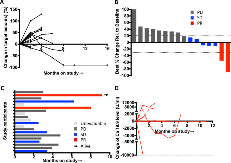
(A) Spider plot from left to right tracks the change in the overall disease burden of patients on treatment, and the rise or fall in the line represents a relative increase or decrease, respectively, in the overall size of measurable “target” lesions on imaging for each patient. These lines demonstrate the variability of the patterns seen, as well as the potential for prolonged response that may be of delayed onset. (B) Waterfall plot of all radiographic responses. Tumor responses were measured at regular intervals and values show the best fractional change of the sum of longest diameters from the baseline measurements of each measurable tumor. (C) Swimmer plot showed time on study and response status. The arrow indicates patients still alive. Gray represents as unevaluable case, black as progressive disease case, blue as stable disease case, red as partial response case. (D) Tumor marker CA 19.9 level change of patients during the treatment and follow-up.