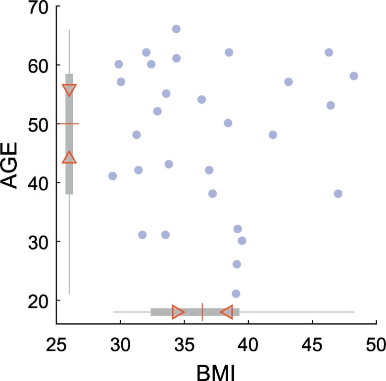
Fig. 1.

Scatter plot of participants' age (y-axis) and BMI scores (x-axis) at baseline. Blue circles represent individual data points. In boxplots along the x- and y-axes, the “central box” represents the interquartile range (IQR) with lower and upper boundary lines at the 25th and 75th percentile of the data, respectively. Whiskers indicate the full range, the red central line indicates the median of the data. Triangles depict the 95% confidence interval of the median value (median ± 1.57 × IQR/n0.5).
