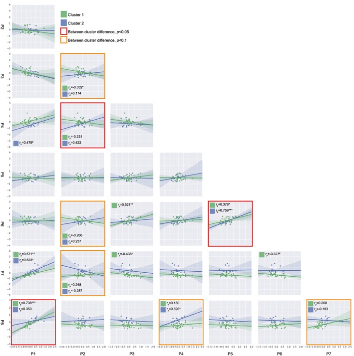
Figure 3.

Associations between molecular rehabilitation responses. Each square displays a scatter plot and regression line of the processes indicated on the x and y axis, for both Cluster 1 and Cluster 2. Differences between correlations were tested by a Fisher's r‐to‐z transformation and indicated with a red outline (P < 0.05) or orange outline (P < 0.1). Pearson correlation coefficients per cluster are depicted for differential correlations and when P < 0.1. # P < 0.1, * P < 0.05, ** P < 0.01, *** P < 0.001.
