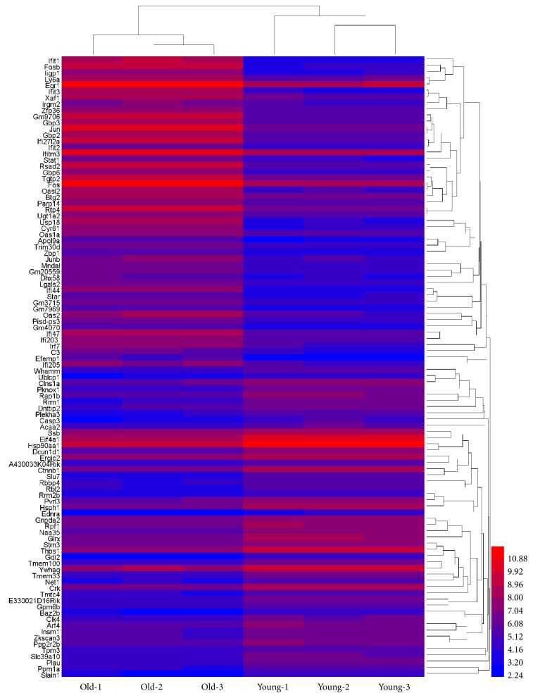
Figure 2.
Heat map visualization for selected differentially expressed genes. Heat map was produced by unsupervised hierarchical-clustering analysis from microarray data for top 50 upregulated genes and top 50 downregulated genes in old mouse ovarian secondary follicles compared to young. The relative expression levels of each gene are mentioned in different colors. The red lines represent high expression, while blue lines represent low expression. The numbers in the right side, corresponding to the different colors, represent the relative expression levels of each gene.

