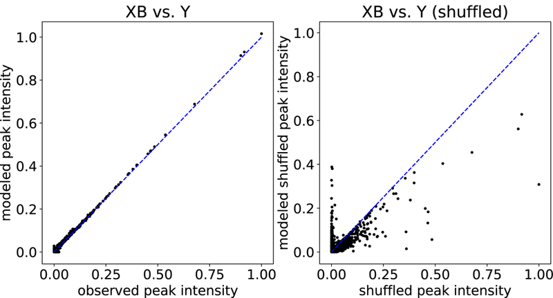
Figure 3: Observed versus modeled peak intensities from Siren.

Each point in the plot corresponds to an MS1 peak, with its true intensity (x-axis) versus its intensity as modeled by Siren (y-axis). The left plot shows results for peaks from 18 spectra, and the right plot is for peaks shuffled from those 18 spectra.
