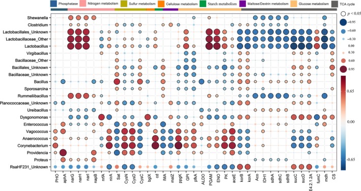
Figure 7.

Spearman rank correlation between functional genes (rows) and genus (columns) across all groups. Blue and red colours represent positive and negative correlations, respectively. Circle size and colour saturation are proportional to the magnitude of the correlation. Statistically significant correlations (p < 0.05) are indicated by black perimeters. Statistically significant correlations (p < 0.05) are indicated by black perimeters. The different colour text on the X‐axis indicates number of genes in three groups higher than that of the other two groups (NC: Blue, BC: Orangered, BG: Green). Orangered or blue stars indicate the relative abundance of bacteria in NC significantly (p < 0.05) higher or lower than BC.
