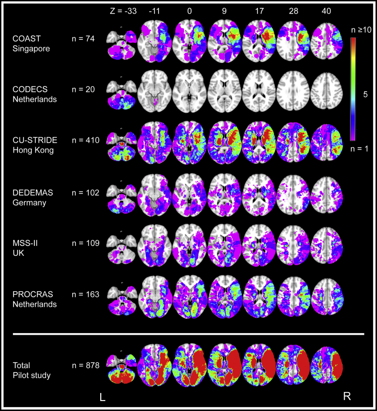
Fig. 3.
Lesion prevalence map for individual cohorts and the collective data set of the Meta VCI Map pilot study. Voxel-based lesion prevalence map of infarcts for individual cohorts and collective data set, shown on the Montreal Neurological Institute 152 T1 template [63]. Every voxel that is damaged in one or more subjects in the cohort is shown in colors ranging from purple (n = 1) to red (n ≥ 10). The right hemisphere is depicted on the right, which is conventional in lesion-symptom mapping studies. To prevent that lesion-symptom mapping analyses are biased by voxels that are only rarely affected, a minimum number of patients with a lesion in a particular voxel is commonly set. Although there is no general rule on where to set this threshold, it is typically set in the range of 5 ≤ n ≤ 10 [66]. In this figure, blue- and purple-colored voxels are damaged in less than five subjects and thus would normally be excluded from lesion-symptom mapping studies. The bottom lesion map was created by merging lesion maps from all the cohorts, which shows a considerably increased number of included voxels after integrating the data from all six cohorts. Note that the left hemisphere is relatively underrepresented; most cohorts used aphasia as an exclusion criterion because it precluded reliable cognitive assessment. Thus, subjects with (large) left hemispheric lesions were often excluded during initial inclusion of stroke patients.

