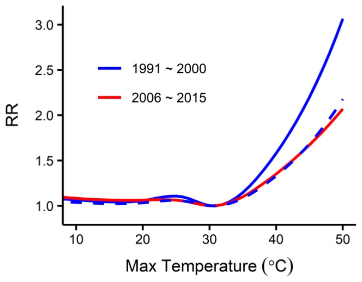
Figure 4.
The overall temperature-mortality relationships during the first (1991–2000) and the last (2006–2015) ten years of the baseline period created using DLNM. The x-axis represents the daily maximum temperature, and the y-axis represents the overall cumulative effects of the maximum temperature on mortality. The dashed curve shows the 43% slope reduced version of the relationship during 1991–2000.

