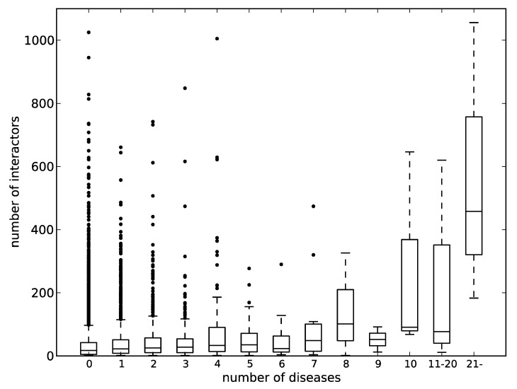
Figure 5.
The correlation between the number of protein–protein interactions and the number of diseases involved. The horizontal axis represents the number of diseases, and the vertical one represents the number of interactors. A box and a pair of whiskers represent quartiles, and the line in the middle of the box represents the median. The dots represent outliers.

