Figure 6:

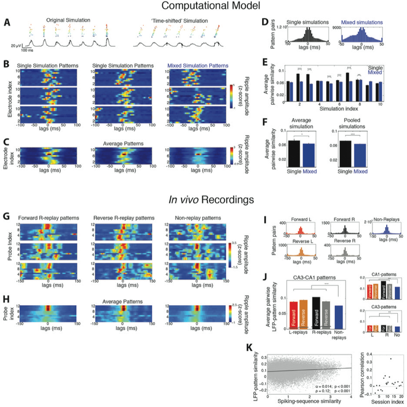
Replays yield consistent spatiotemporal LFP-patterns compared to non-replays. A. Example raster plot of all spiking cells and ripple LFP (black trace) in a simulation, before (left) and after (right) introducing time shifts to the membrane potential of cell groups. Each ‘place cell group’ is indicated by a different color. B. Example LFP-patterns of ripples from individual simulations (left and middle) and from a ‘mixed simulation’ (right; 0 ms: ripple peak). C. Average LFP-patterns from the corresponding simulations. D. Distribution of lags yielding maximum correlation between all pairs of LFP-patterns in single and mixed simulations. E. Average similarity between pairs of LFP-patterns in each single simulation (black) versus the corresponding mixed one (blue; mean ± se). F. Average similarity per-simulation (left) and after pooling all simulations (right). LFP-patterns of individual simulations were significantly more similar to each other than those of mixed ones. G. Examples of LFP-patterns from in vivo recorded forward R-replays (left), reverse R-replays (middle) and non-replays (right) in one session. Probes 1–8 and 9–12 are located in CA3 and CA1, respectively. H. Average patterns of the corresponding ripple types in G. I. Distributions of lags yielding maximum pairwise LFP-pattern correlation for all ripple types. J. Average similarity (mean ± se) between LFP-patterns of all replay types was significantly higher than that between non-replays. Black lines indicate chance-similarity baselines. Right: Same for patterns computed only over the CA1 or CA3 probes. K. LFP-pattern similarity between all pairs of ripples in a recording session versus their spiking profile similarity. The two measures were significantly correlated (line: least squares linear fit; α: slope, p < 0.001, F-test; ρ: Pearson correlation, p < 0.001, Student’s t-test). Right: Distribution of Pearson correlations for each session. The average per-session correlation was statistically significant (cross: <ρ> = 0.04; p < 0.05, tailed sign test). All patterns in this figure were smoothed over time with 5-point moving average for plotting clarity. Asterisks: one, p < 0.05; two, p < 0.01; three, p < 0.001; tailed WT-FDR).
