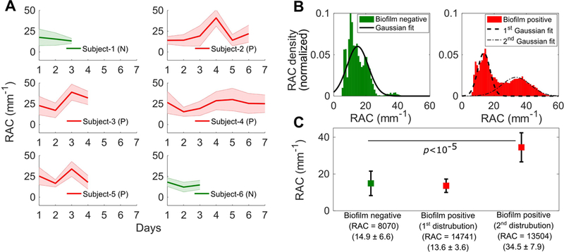
Figure 4.

Quantitative analysis of ETTs based on RAC metrics between groups. (A) Plots showing the mean RAC for all subjects (Subjects 1-6) from the day of intubation until extubation. The plots in green represent biofilm-negative (N) ETTs and plots in red represent biofilm-positive (P) ETTs. The lines represent the trends for the mean RAC values while the shaded regions represent the standard deviation of the RAC values. (B) Histogram plot and fit of all ETT RAC values. (C) Measured average RAC values, standard deviations, and statistical analysis presented by group.
