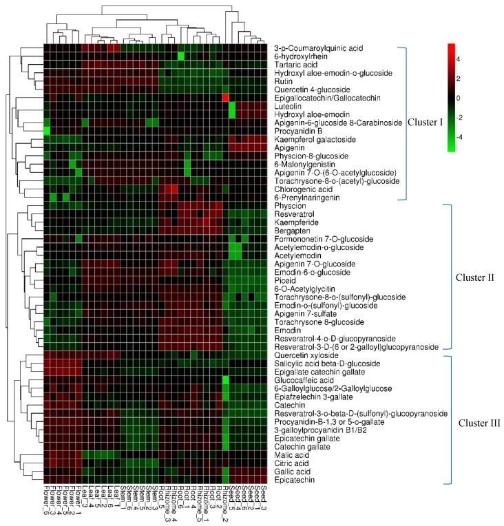
Figure 3.
Heatmap analysis of the relative distributions of 53 identified metabolites in different tissues. The heatmap was exhibited using a hierarchical clustering algorithm based on the normalized average signal abundance. The red and green color in the heatmap represent an increase and a decrease of metabolite level, respectively.

