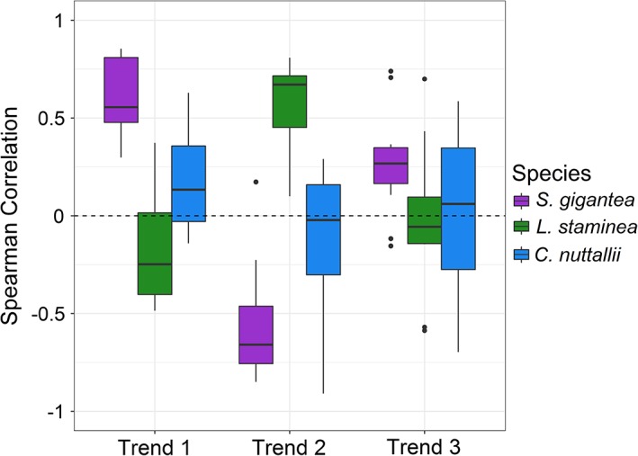
Figure 5.

Spearman's rank correlations between the observed clam biomass and the three trends produced from the best‐fitting DFA model (Model 1, Table 3) for S. gigantea, L. staminea, and C. nuttallii. Boxplots summarize the distribution of correlation coefficients between each species and trend. Each rectangle spans the interquartile range (IQR) of the correlation coefficients and the median is shown by a thick line. Whiskers include data within 1.5 × IQR of each quartile beyond which outliers are shown as filled circles.
