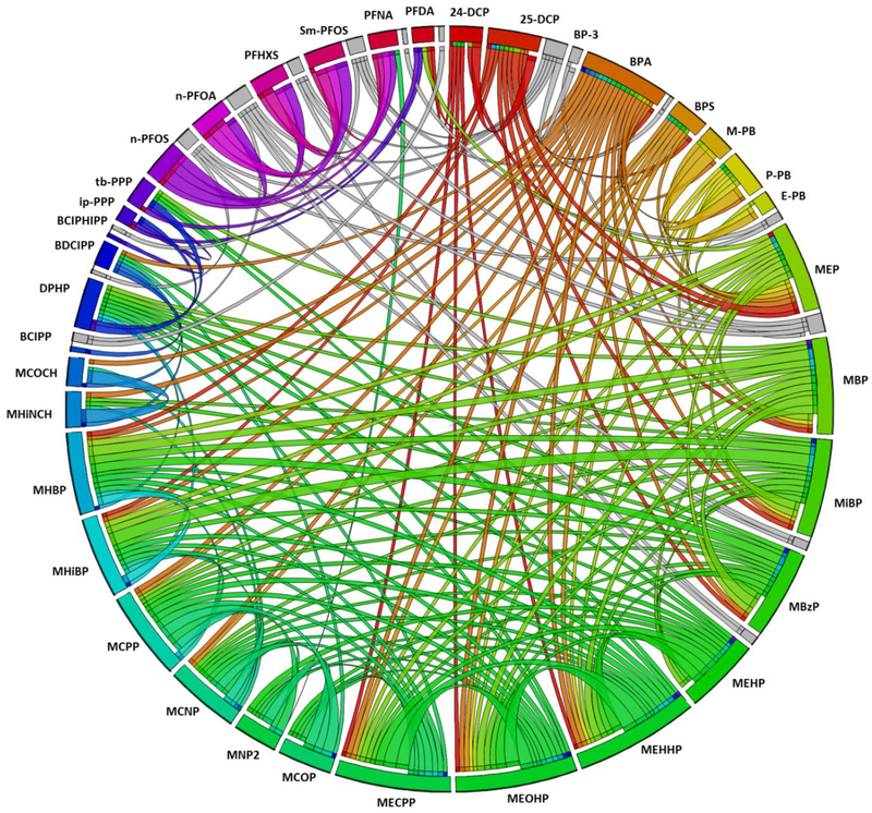
Figure 5:
Circos plot displaying Spearman correlations between biomarkers. Correlations are represented by ribbons (i.e., lines) between variables with the width of the ribbon corresponding to the strength of the correlation such that a wider band represents a stronger correlation. Rainbow colored bands are used for positive correlations (using a different color for each biomarker) and negative correlations are shown in gray scale. Only Spearman correlations >0.25 or <−0.25 and statistically significant at p<0.05 are displayed.

