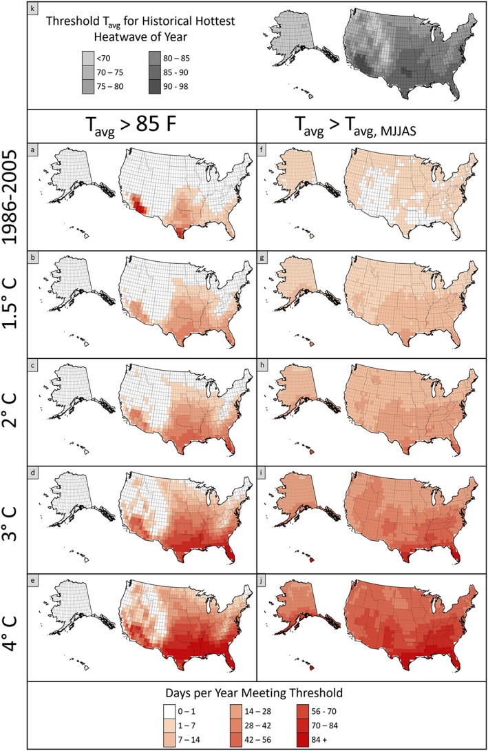
Figure 3.

Average number of days per year that U.S. locations are projected to experience heat waves based on metrics of absolute and relative measures of average daily temperatures. The top panel (k) shows the absolute temperature associated with the annual maximum heat wave threshold. As shown in Figure 2, the historical plots (1986–2005) show the total number of days exceeding each threshold in the baseline, and subsequent plots show the increase in the number of days for each global warming threshold.
