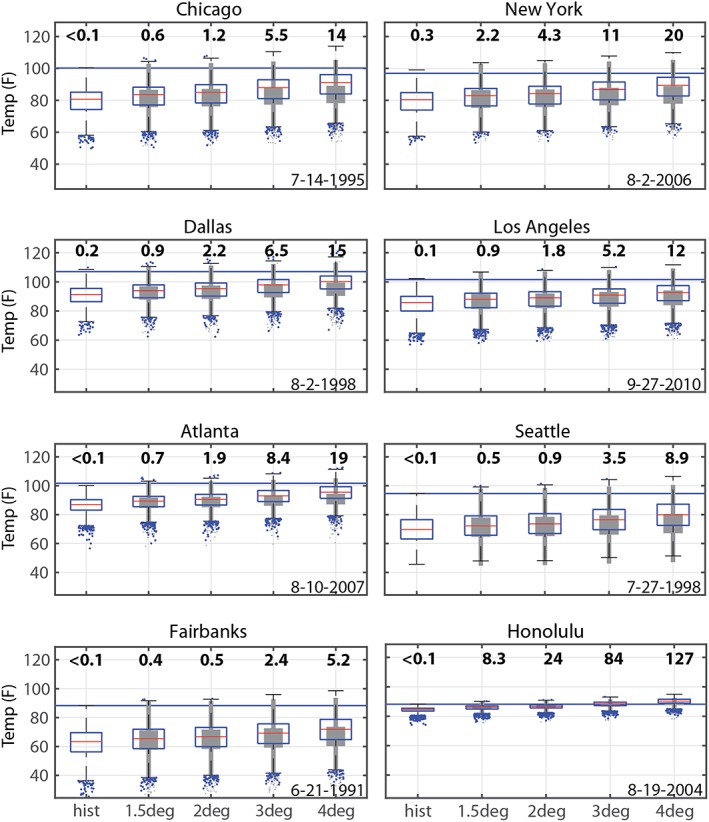
Figure 5.

Distribution of summer temperatures in select U.S. cities at different warming thresholds. In each case, the blue horizontal line represents the Berkeley's Earth Surface Temperature modeled temperature representing the extreme heat event on the date specified. The distribution of all summer daily maximum temperatures is shown as a blue box and whisker plot for each global warming threshold, with the boxes representing the interquartile range of summer temperatures and the whiskers extending from the 5th to 95th percentiles. Numbers above each boxplot show the number of days per summer that these historical temperature extremes are expected to occur for each warming threshold. The gray box and whisker plot illustrates what the distribution of summer daily maximum temperatures would be if the historical distribution were shifted up by the average global warming.
