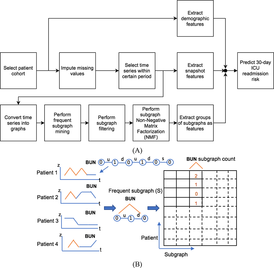
Fig. 1.
(A) The flowchart of proposed approach, moving from selecting data to predicting readmission risk. (B) An example of creating matrix of common subgraphs. Only the Blood Urea Nitrogen (BUN) trend graph for patient 1 is shown (BUN 0 1 0 1 0 0). The frequent subgraph is (BUN 0-u-1-d-0), noted as S. Patient 1 has two frequent subgraphs S; patients 2 and 4 have one; and patient 3 has no S. The edge labels, “u,” “d” and “s,” are short for “up,” “down” and “same,” respectively.

