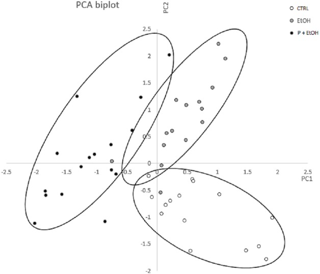
Figure 3. Principal Component Analysis (PCA) represented by a scatter plot of PC1 and PC2.

The different groups (CTRL, EtOH and P+EtOH) are displayed with different colours (see legend inside the figure). The 95 % confidence ellipses are also shown. Principal Component Analysis (PCA) represented by a scatter plot of PC1 (highly correlated with Perimeter, Major axis of the best fitting ellipse, Feret’s diameter and Integrated Density) and PC2 (highly correlated with Minor axis of the best fitting ellipse). The different groups (CTRL, EtOH and P+EtOH) are marked differently (black, white and grey; see legend inside the figure). The 95% confidence ellipses are also shown.
