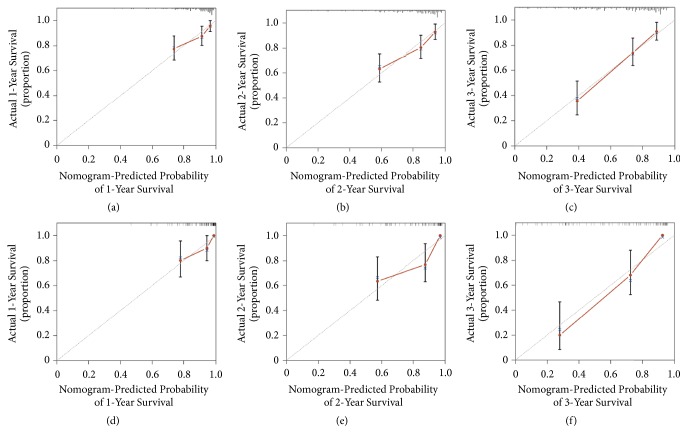
Figure 2.
The calibration curves for the predictions of overall survivals in the training ((a)−(c)) and the validation ((d)−(f)) cohorts at 1, 2, and 3 years after diagnosis. The dashed line represents perfect correspondence between the probabilities predicted by the nomogram (x-axis) and calculated by Kaplan-Meier analysis (y-axis), respectively.

