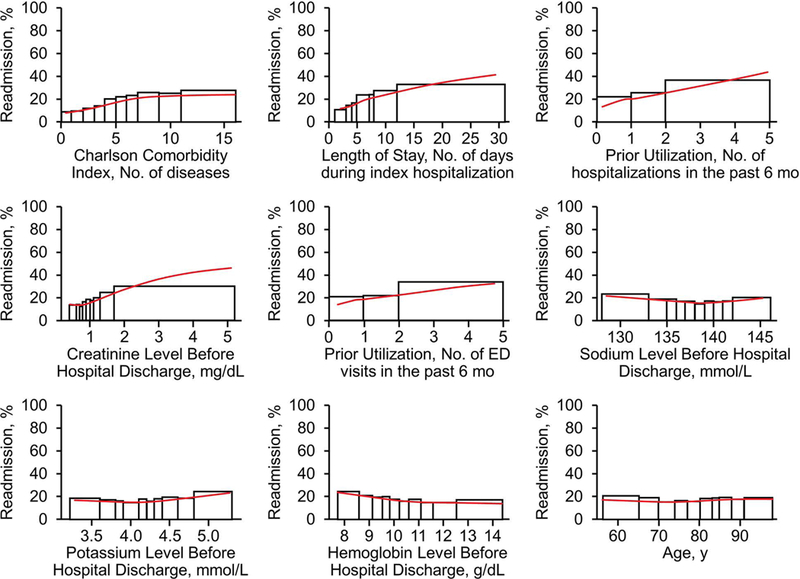
Figure 1.

Main Effect Plots for 9 Predictor Variables. For each set of rectangles, the widths correspond to consecutive deciles of the original data and heights correspond to the empirical readmission rate for observations falling within that range. The red curve in each plot is a smoothing spline fit to gradient boosting machine predictions for each observation across the respective variable. ED indicates emergency department.
