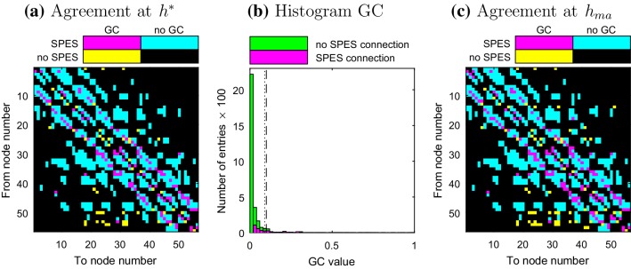
Fig. 3.
Patient 2 a, c Comparison of the adjacency matrices of the SPES and GC network for thresholds and respectively. The numbers of the electrodes correspond to the layout in Fig. 1a. b Histogram of the distribution of the GC connections. The dashed and dotted lines indicate the thresholds and respectively

