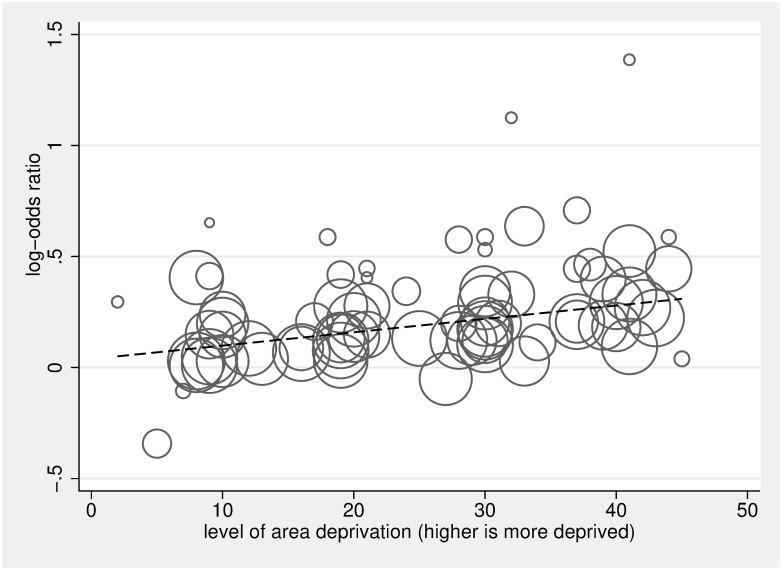
Fig 6. Dose analysis of area deprivation on log-odds of hospital versus home death, compared to the least deprived group.
The scatter plot in Fig 6 depicts the linear association between dose of area deprivation (0 being least deprived, 50 being most deprived) and the log-odds of death in hospital versus death at home/hospice/LTC, compared to the least area-deprived group. The circles represent the dose-specific estimates from the 20 included studies [5,21,24,26,34,64,70,86–98]; each study contributes 2, 3, or 4 circles reflecting the number of area-deprivation categories included in the study (the reference category, the least deprived group, is not plotted), and the size of the circle corresponds to the inverse of its total variance. The regression line calculated using the 2-stage glst command in Stata with random effects accounting for within-study dependence reflects a significant positive relationship between dose of area deprivation and likelihood of hospital death (for a 10× unit increase in dose β = 1.07, 95% CI 1.05–1.08, p < 0.001). LTC, long-term care.

