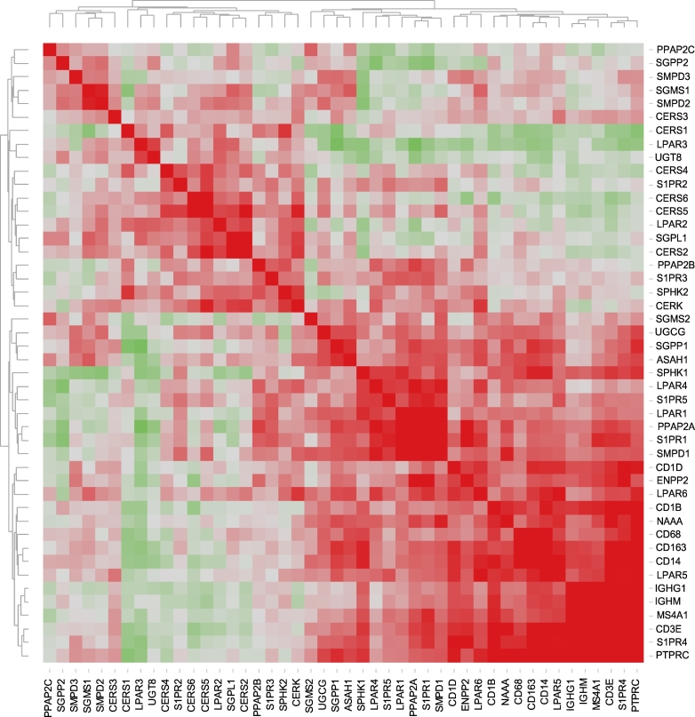
Fig. 3.
Heat map representing the correlation matrix for sphingolipid/lysophosphatidate/immune-associated genes. Pearson correlation matrix was calculated across all genes and the entire patient cohort (Table S2). The corresponding correlation coefficients were subjected to unsupervised hierarchical clustering using Euclidean distance measurement (average linkage clustering). Red-green color spectrum for correlation coefficients; each colored square illustrates a gene-gene interaction; the color intensity represents the correlation strength; color code: red, positive correlation; green, negative correlation. (For interpretation of the references to color in this figure legend, the reader is referred to the web version of this article.)

