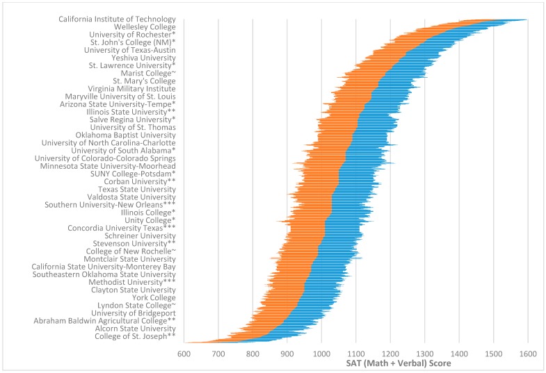
Figure 1.
Overall distribution of 25th to 75th SAT (Math + Verbal) percentile scores for colleges and universities included in this study (for a full list see Supplementary A). 25th percentile scores for an institution are indicated by the far left point of the left region (orange) of the graph, whereas 75th percentile scores are indicated by the far right point of the right region (blue). The dividing line between the two sides is roughly the 50th percentile (the average between the 25th and 75th percentile scores). Selected school names are highlighted along the y-axis for ease of reading. The full list of schools used to create Figure 1 can be found in Supplementary A. * At least some students were not required to supply scores to the school; ** The school did not report all students it had scores for, or did not tell U.S. News if it had; *** The data was reported to U.S. News from a previous year; ~ The school may not require scores from all applicants and may not have submitted data for all students.

