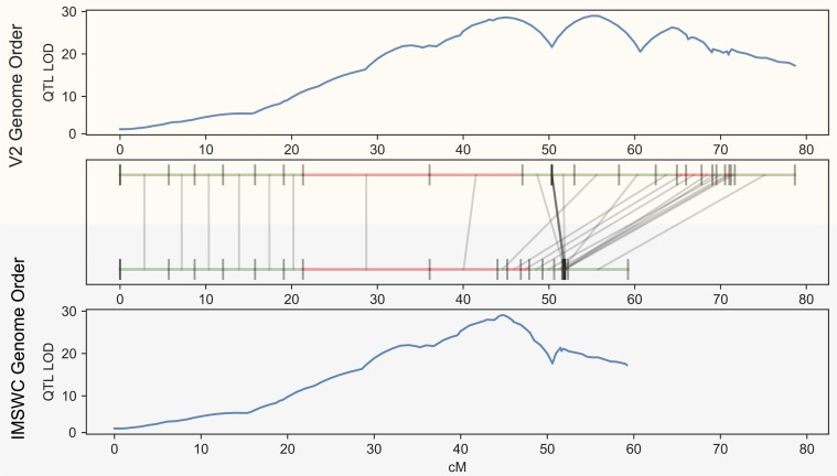
Fig 7.
The results of QTL estimation using the V2 map (top panel) versus the IMSWC optimized map from GOOGA (bottom panel). The maps are aligned in middle panel. Each genomic scaffold is drawn to its genetic map length and denoted in green if it maps on the forward strand or red for the reverse strand. Grey lines connect the same scaffold between maps. QTL estimates are plotted for both panels as the log of the odds (LOD) score on the y-axis, and genetic map location on the x-axis.

