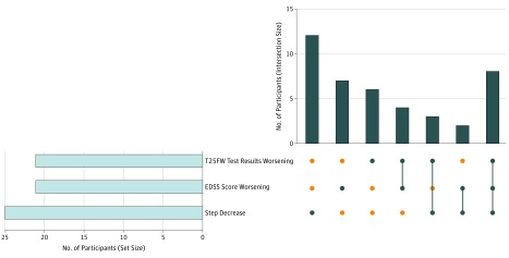
Figure 3. Number of Participants With Worsening in Expanded Disability Status Scale (EDSS) Score, Timed 25-Foot Walk (T25FW), or Average Daily Step Count During the 1-Year Study.
The horizontal bar graph to the left shows the number of participants who worsened in each of the 3 outcomes. The vertical bar graph to the right shows the shared number of participants (intersection size) who worsened during the year for 1 or more of the 3 outcomes, depicting each combination separately. A blue circle indicates whether that group of participants exhibited 1 or more of the 3 listed outcomes in the corresponding matrix cell. An orange circle indicates that that group of participants did not exhibit that outcome. A vertical blue line illustrates the column-based associations by indicating overlap (eg, a group with 2 blue circles connected by a vertical blue line exhibited both of those listed outcomes).

