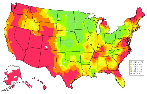
Figure 3. Difference in County-Specific 30-Day Risk-Standardized Acute Myocardial Infarction Mortality Rates Between 1995 to 1998 and 2011 to 2014.
The difference was calculated as the percentage point between the 2011 to 2014 combined rate minus the 1995 to 1998 combined rate. Counties are shaded according to the difference in percentage points of the risk-standardized acute myocardial infarction mortality rates (percentage). Counties with negative values had mortality rates that were lower in 2011 to 2014 than in 1995 to 1998. Counties with the largest decline between 2011 to 2014 and 1995 to 1998 are shaded green, while those with the smallest decline or even increase in mortality between 2011 to 2014 and 1995 to 1998 are shaded red. Counties are shaded white if there were missing or insufficient data that precluded the calculation of mortality rates.

