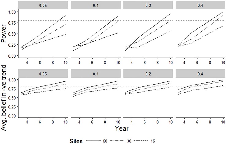
Fig 7. Comparisons of two alternative models of power for a single species’ decline.
The underlying simulated decline was 30% per year over 10 years. Different columns represent different starting proportional covers of a species within a plot. The top row represents the results from a classical frequentist power analysis, using maximum likelihood parameter estimates of a simple linear model fitted to interval-censored data (Model 3 of [65]). The bottom row represents the average belief in a declining trend of any size resulting from a Bayesian hierarchical model fitted to interval-censored data. Interval-based data censoring was based on an approximation of the Domin scale in both cases. Trend line formatting relates to the number of modelled sites (n = 15, 30 or 50). The broken horizontal line represents the typically desired level of 80% power; although this is not appropriate for a Bayesian model, it is also included for this model-type to help assist with visual comparisons between the different scenarios.

