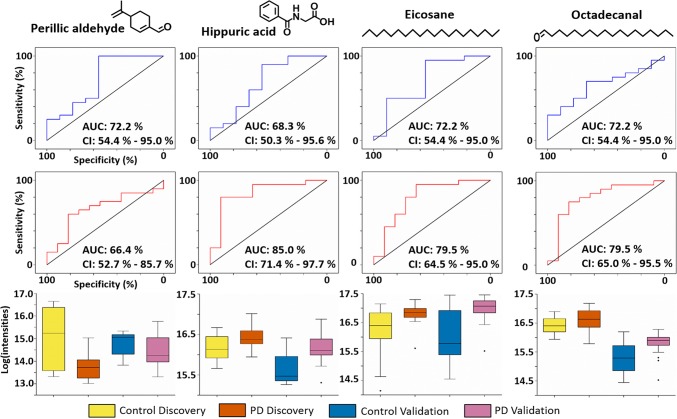
Figure 3.
ROC curves and box plots for analytes of interest: In each panel from top to bottom: ROC curves for both discovery (blue) and validation (red) cohort for four analytes common to both experiments. Confidence intervals were computed with 2000 stratified bootstrap replicates, and diagonal black line represents random guess. Box plots show comparison of means of log scaled peak intensities of these analytes, where black dots were outliers.

